Project Type: 2_Invention, Plasticity and Visual Music

  • Assignment 2: Seasonal Synaesthesia: Summer 2020

    Assignment 2: Seasonal Synaesthesia: Summer 2020

    TASK: Make a short animated film between 1 and 3 minutes long about a season of the year. Use some of the animation techniques covered thus far in the unit to evoke particular qualities such as temperature, light and atmosphere of winter, spring, autumn or summer. This can be a completely abstract film, or include elements of narrative. The structure, medium, technique and approach are up to you.
    Do some preliminary research into the condition of synaesthesia and take notes on whether there are specific stimuli that you associate with other perceptions.
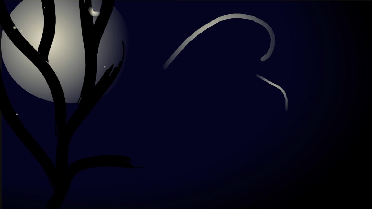
    See Post on Synaesthesia
    Build-up your animation process with short animated tests, photographs, diagrams and, if useful, a working storyboard. It is often helpful to piece some of these tests and diagrams together in your timeline along with your scratch audio
    track, or to devise a series of rules that will guide the production process.
    Start by making an ‘animatic’. Begin developing the sound-scape for your film and use a scratch audio track. Avoid using music and if you do use it, do not allow it to play throughout your film as this project is not a music video.
    Upload your film to your learning log, along with your animatic, diagrams, drawings and a reflection about your process, detailing how you arrived at your idea, any experiments undertaken, and insights gained from your technical, theoretical or other research.

    !! Note – unfortunately Premiere crashed as I was trying to export all the clips for the animatic. I still need to sort out the sequences of the animatic, but that will only now be relevant going forward if (as I anticipate) I develop this further for Assignment 5.

    This film continues my work on abstract animation about Summer from:

    SE2.5 Sound and Image animatic: Summertime

    In that project I had started with one image of summer – greens, yellows and langorous water. Then introduced some random colour changes to give something much more lively and dance-like that had not initially occurred to me, but equally represents a different aspect of summer. I therefore find the idea of synaesthesia somewhat problematic. As I obviously do not have that condition I find it very limiting, reinforcing imagined stereotypes rather than the liberating experience that people with synaesthesia esperience.

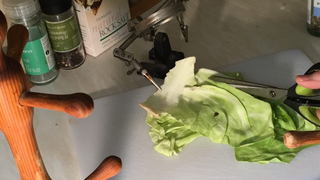
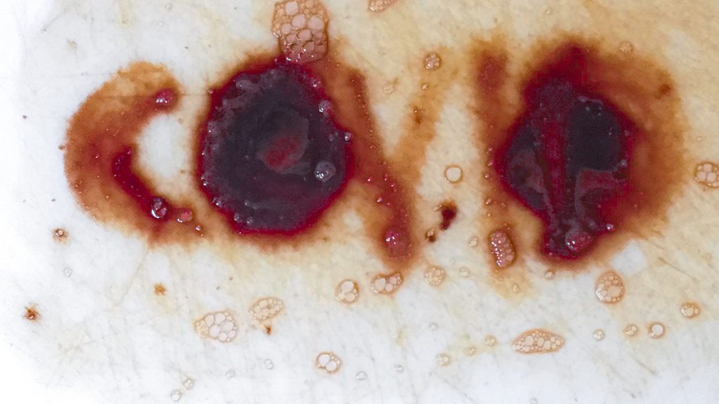
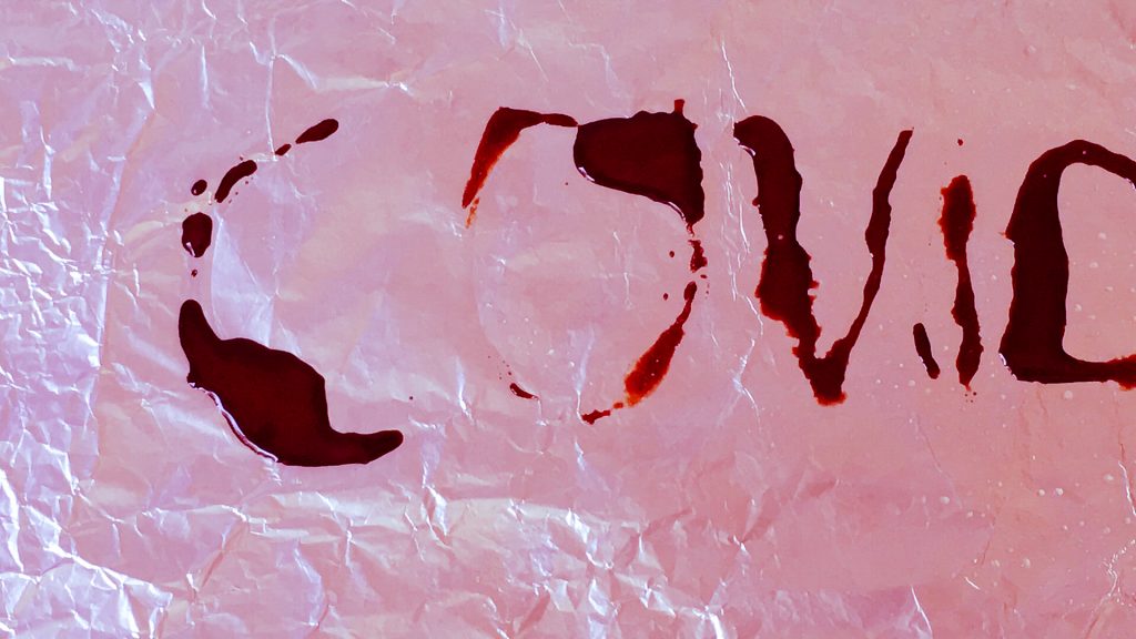
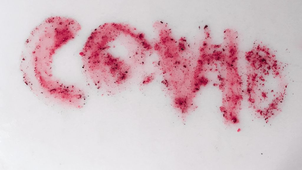
    I also had restrictions under COVID-19 because my daughter was using my art washing space as her kitchen and so any work with physical media like painting or printmaking was not possible.

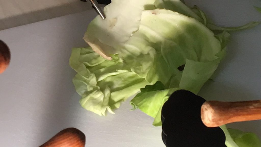
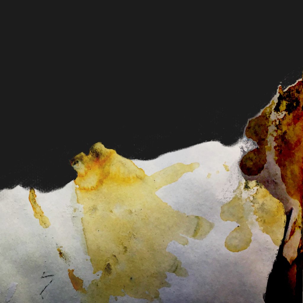
    For this assignment I therefore took a photographic approach, recording and exploring my experience of of summer: real images (rotting apples as well as flowers and butterflies) and sounds (traffic as well as bird song), to challenge my stereotypical ideas rather than repeating imagined cliche.

    I wanted to create and build on accidental effects, exploring abstractions of time, colour and non-narrative editing drawing particularly on my study in this part of the course of:

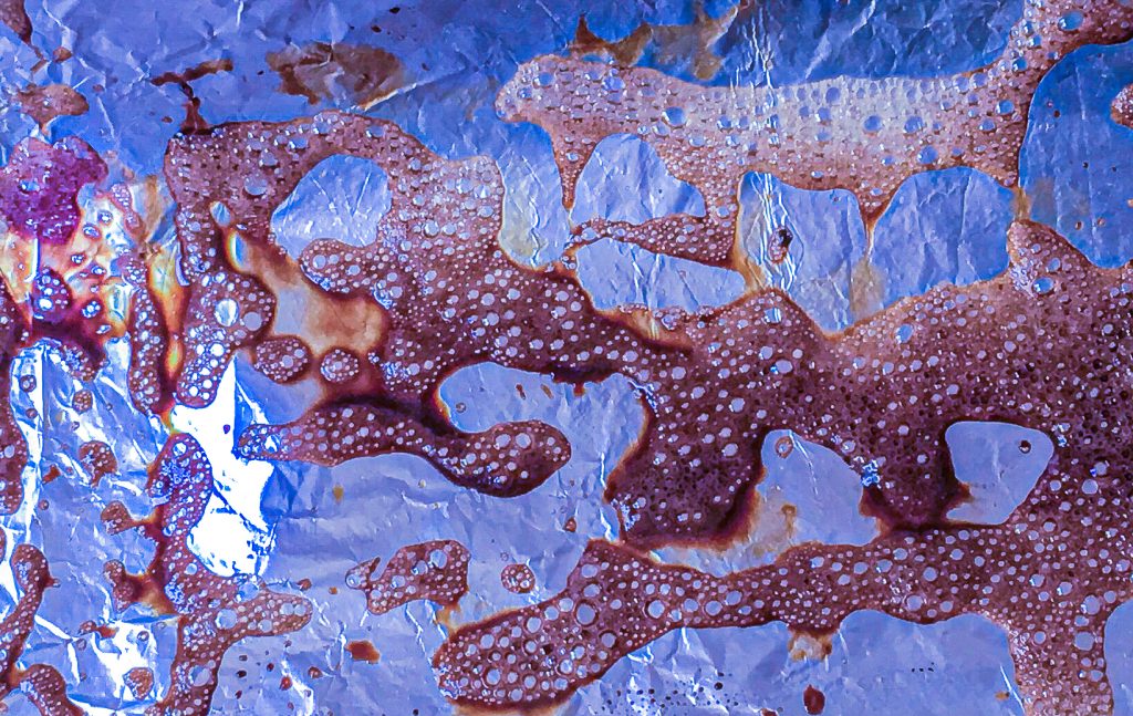
    I worked with photographs, sound and video taken over the course of two consecutive days in August when the weather was very hot, followed by thunderstorms. Then explored different effects and editing strategies in Adobe Lightroom and Premiere.

    Inspiration

    Stan Brakhage

    Abstraction of ‘vision without words’ where ‘the untutored eye’ sees abstract shapes and colours unfiltered by language to create a symbolic world of emotional response.

    I also looked at:
    Maya Deren
    Her black and white work is likely to influence my documentary style in Assignment 3 and VisCom Advanced Practice. But on reflection I decided here to focus on colour.

    Stream of consciousness motion blur and reflected movement, colour abstraction.
    colour abstraction and suggested emotions
    Looks intriguingly pixellated on a large iPad screen. Adds to the dreamlike effect.
    https://youtu.be/jJl-Gpx6mAk
    Inversions and layering opposite movements
    alternation of video and abstraction

    dogstarman has lots of Inspiration indeas.

    Sharpness of line and slowing down out of chaos
    ‘Classic’ Brakhage rapid sequence of brilliantly coloured image. Use of different edges and textures as well as colour combinations. Pixellated on my iPad Pro.
    https://youtu.be/_FRr-_GABuU
    Khrjanovsky. Combines photographic and drawn animation. To get feeling of butterfly in urban environment.

    Process

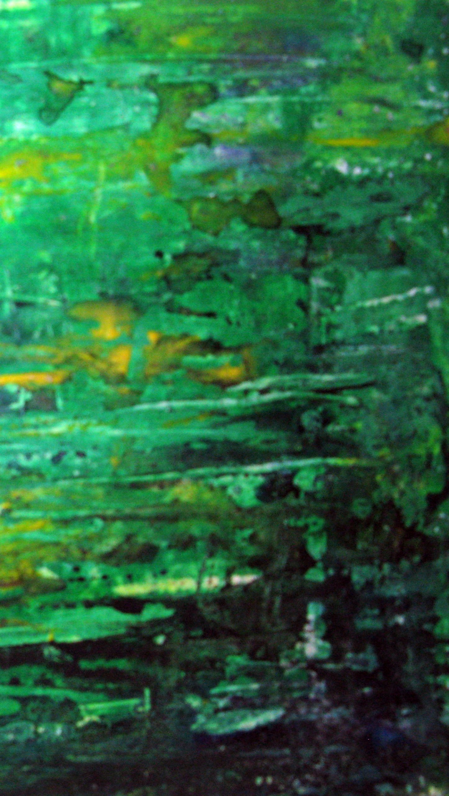
    I started with a rough plan following observation of my garden from dawn to dusk to observe the types of colours and sounds I wanted. With the original idea – before studying Brakhage in detail – of using time of day as the underlying narrative. I then took photographs, sound and video taken over the course of two consecutive days in August when the weather was very hot, followed by thunderstorms.

    Then, based on my actual feelings and experiences – real images (rotting apples as well as flowers and butterflies) and sounds (traffic as well as bird song)

    • I started with a rough selection of photos and video that I cropped and sequenced as CRW images in Lightroom because it is easier to change things around. I also experimented with Black and White possibilities. But decided to go with colour.
    • Then I exported the selected images as jpg, and imported into Adobe Premiere and experimented with different effects and editing strategies involving nesting, repetition, different timing etc. (!! I still need to export these)
    • In parallel I edited the long sound files into shorter clips that I could superimpose to better fit the length of the video.
    Sound
    Dawn
    9am
    10am
    Bees
    Butterflies 1

    Butterflies 2

    Final Concept

    I had many different ideas for this video after ‘experiencing summer’ with a new eye. Not only the butterflies on the brassicas, the red hyssop flowers, the sun through the vine leaves on the archway, the shadows on the wall and path, the bees and flies, the wind and storm. But also the undercurrent of lockdown, crowded beaches threatening second waves and burning forests in Brazil and California. This could have been put together as a documentary ‘stream of consciousness’ but that would not have been ‘abstract synaesthesia’. And I wanted to do something more experimental.

    I started to explore different editing strategies inspired by Brakhage, going through his videos again. Following Brakhage I did not want to produce a structured animatic, but to work in a much more responsive way to what emerged from editorial experiments in combining sounds and images to complement or contrast each other.

    I also considered other formats eg square to give a sense of claustrophobia I felt. But in the end I decided to go with more widescreen and immersive.

    I had a lot of contrasting material from different times of day that could have provided some sort of narrative. Dawn I had found particularly interesting with its more pastel blue colours, shadows and birdsong. But again as this was a synaesthesia project, I decided to go more with my instinctive visions of summer after all. Then go back to the other material later.

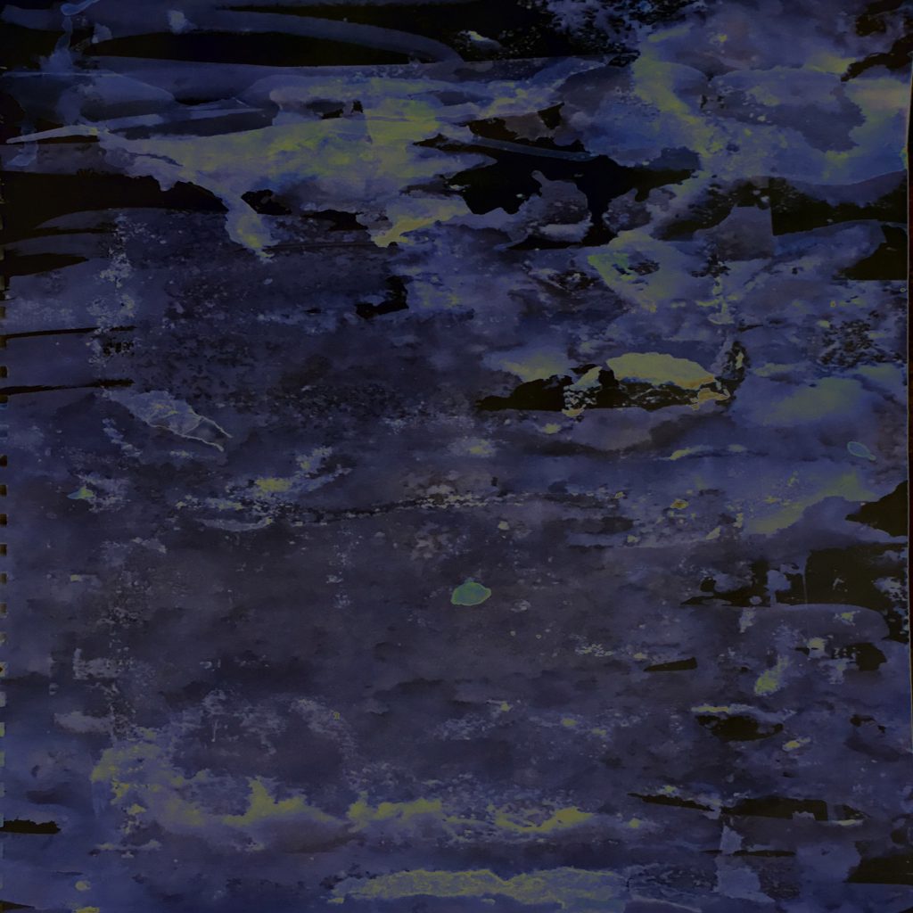
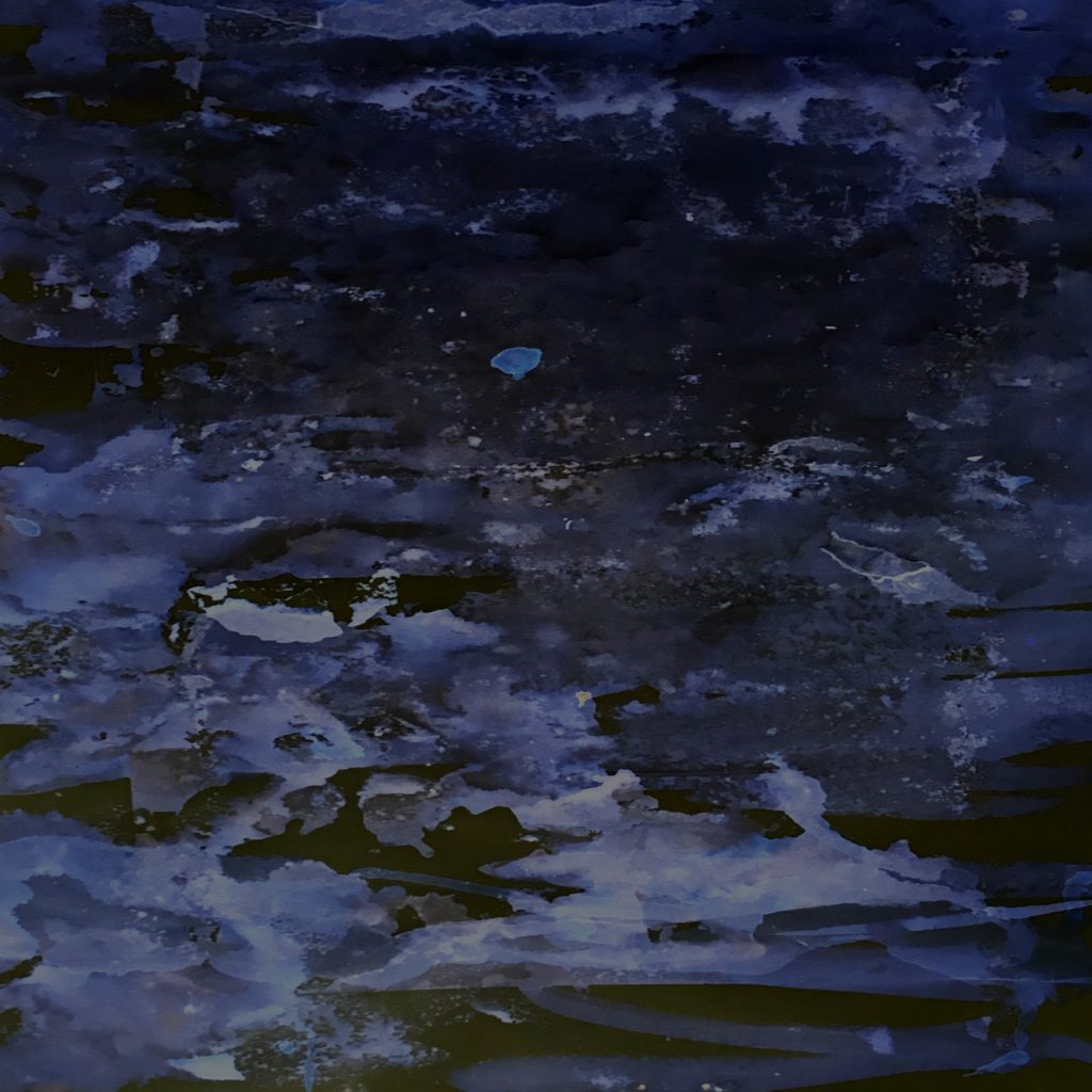
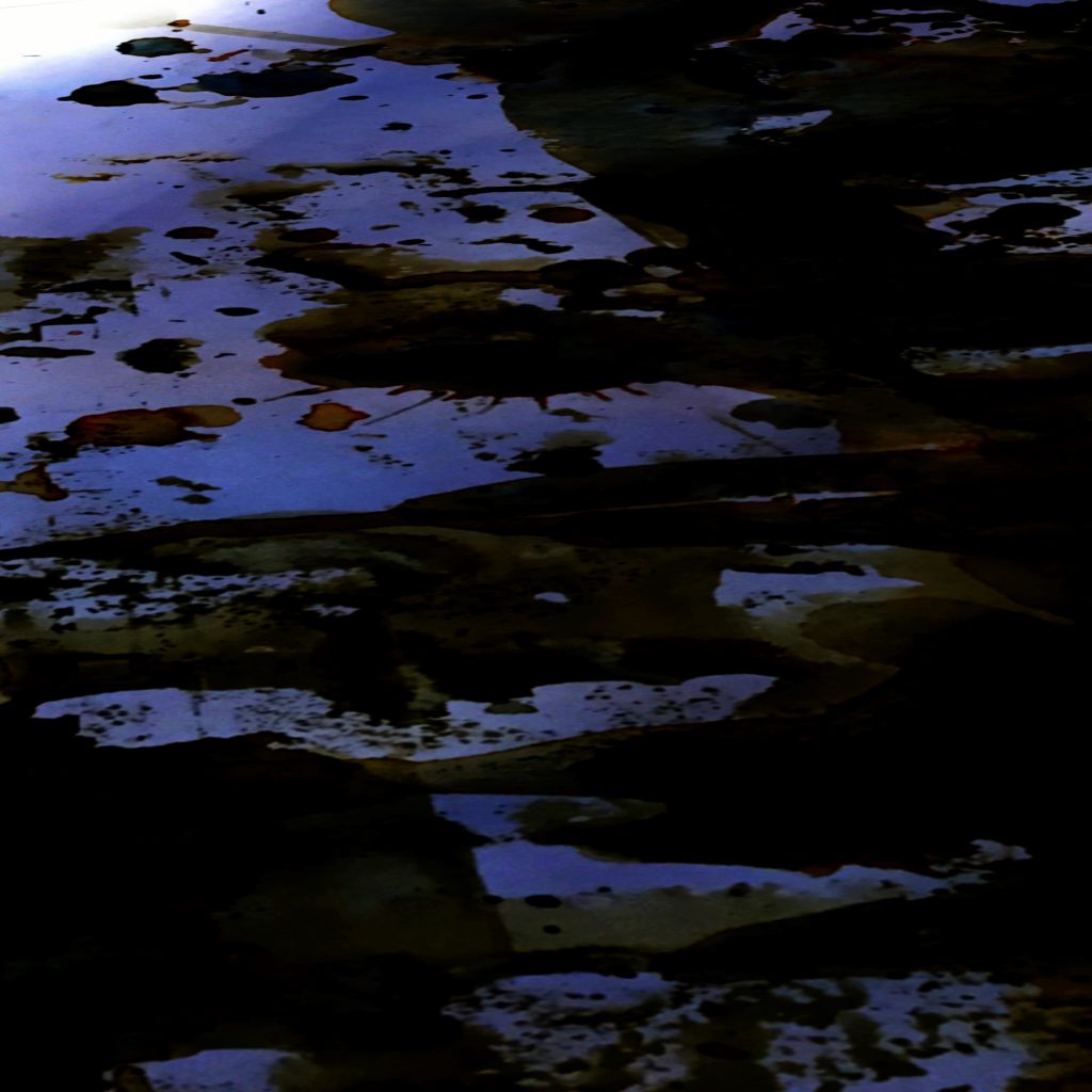
    What I was aiming for was something very abstract. of flashing lights and darks of mid morning/mid-day when our garden has tree shade shapes around pools of bright light. Using the clips of midday butterflies.

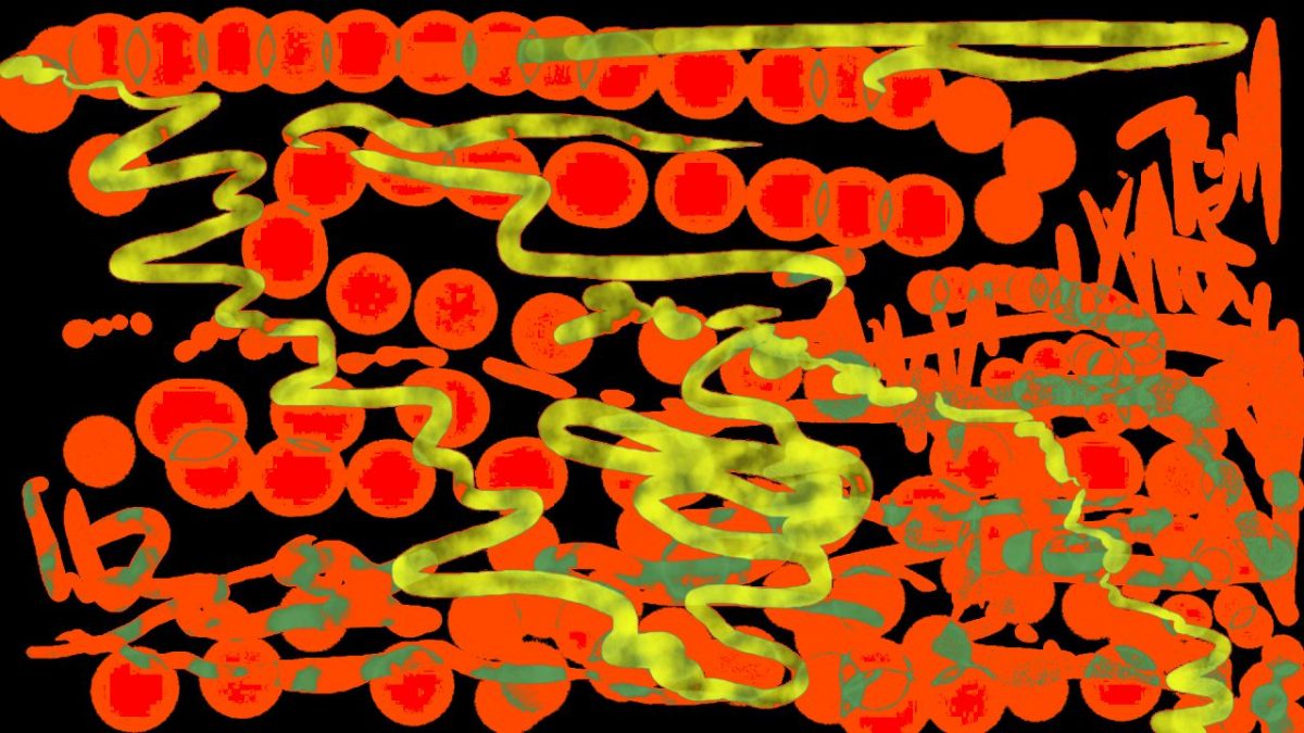
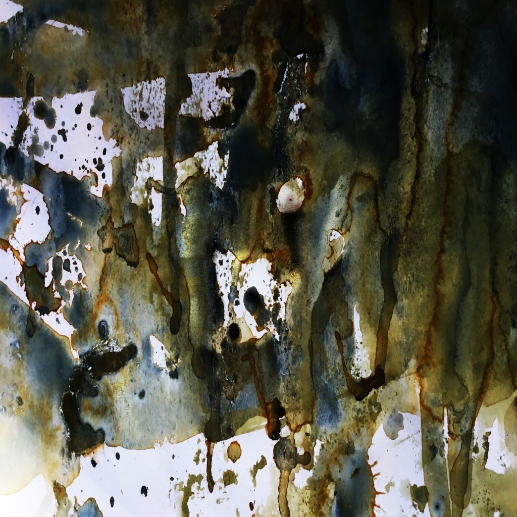
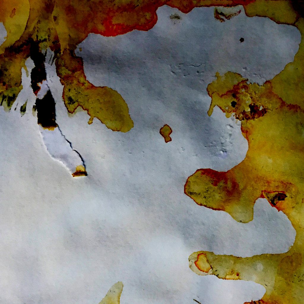
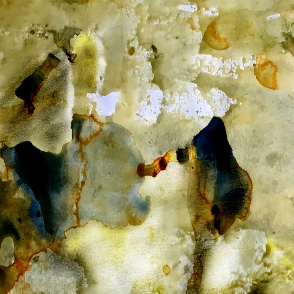
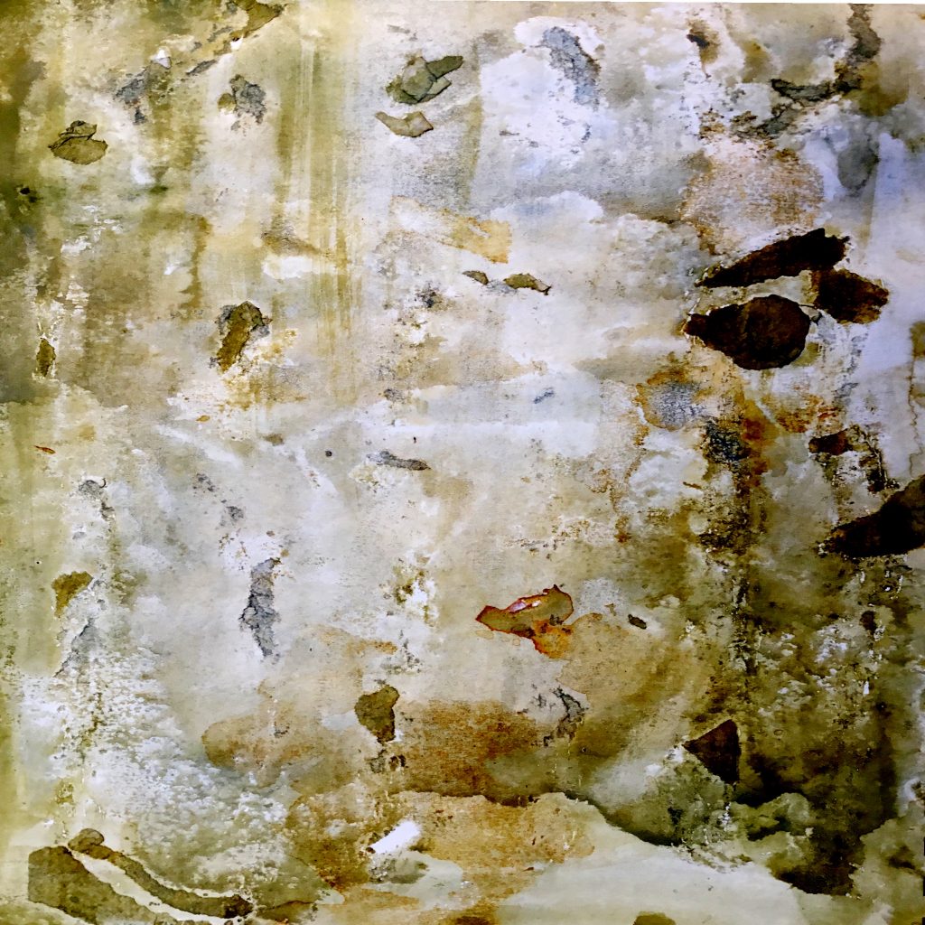
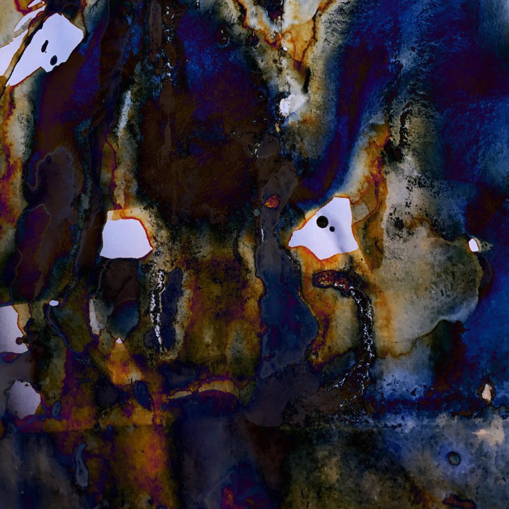
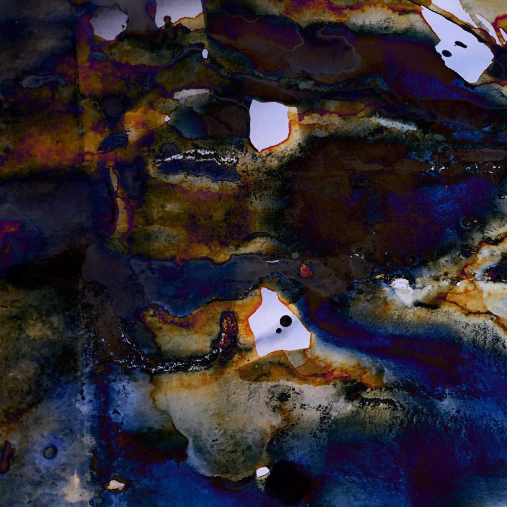
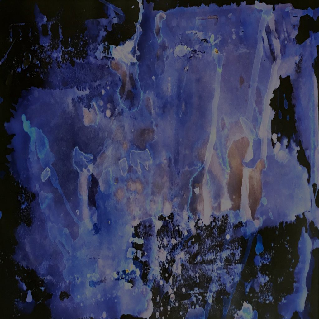
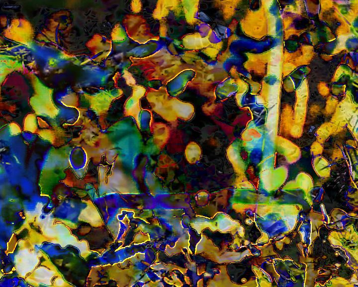
    I decided to use Adobe Premiere and experiment there with some of the layering and blending experimentation from Project E2.11 Setting Rules.. I focused particularly on the Lumetri colour filters, layering the video clips, scaling and moving these against each other with multiply, screen and difference blend modes to get different shapes. Whilst editing it was difficult to get a clear idea of what the video would look like because the multiple layering and blending needed separate rendering and would not play back in real time.

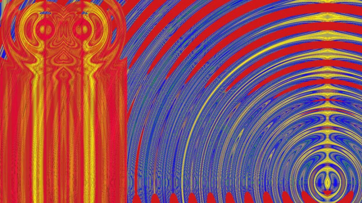
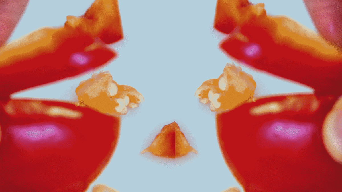
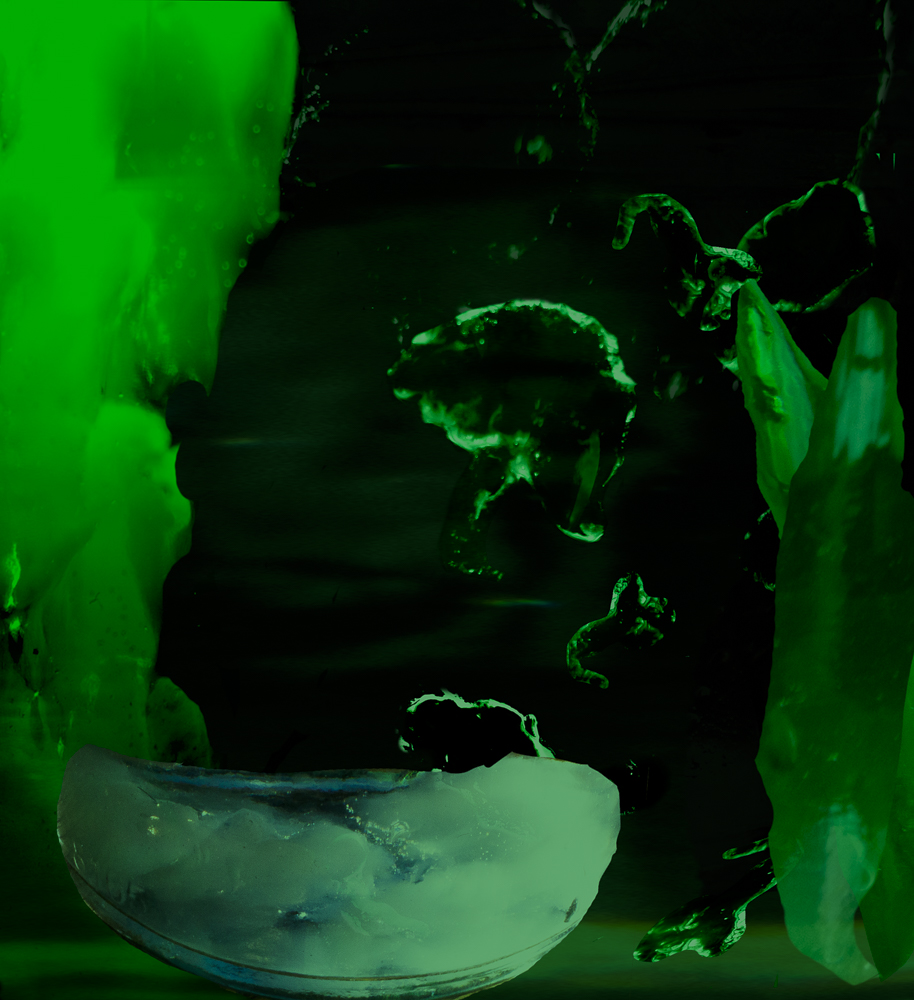
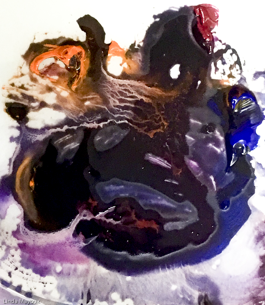
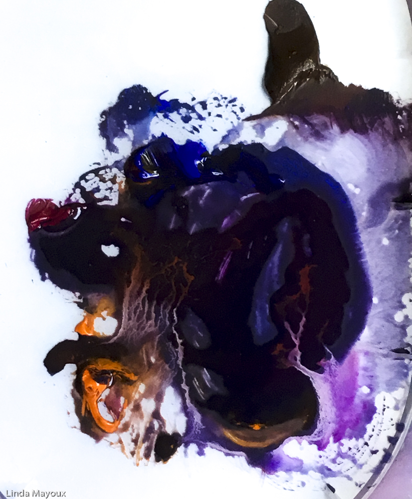
    I focused on highlighting the butterflies getting different colour combinations. But what I discovered as I watched the resulting experimental video once it had been properly rendered are the moving faces – one or two eyes sometimes a head silhouette – and animals like munching rabbits and frogs I see between the shapes. I could play more with this layering of meaning and interpretation – the hidden things in the shadows under the bright cheery butterflies.

    I added sound in two tracks of birds, but also my own shuffling and rustling. Possibly it is better without sound.

    I enjoyed working in this way, but need to think a lot more about what I might be trying to achieve – while still retaining the ‘accidents’.

  • E2.11: Setting Rules, animatic

    E2.11: Setting Rules, animatic

    “Serial art is art that adheres to a strict set of rules to determine its composition or to determine a series of compositions…. Some serial artworks are modular and are based on the repetition of a standard unit, like Andy Warhol’s soup cans or Joseph Alber’s coloured squares, while others offer variations on a theme, like Sol LeWitt’s Serial Project No.1 which showed all the different combinations of an open and closed cube.

    Serial art has its roots in conceptualism and minimalism and gained popularity in America and Europe in the 1960s as a way for artists to create art without resorting to personal expression. (In the 1960s artists began to challenge the assumption that their role was to create special kinds of unique art object, in an attempt to bypass the increasing commodification of the art world).”

    Art Term- Serial Arts. tate.org.uk

    I have studied serial art before and it is not really my area of interest. But I have been fascinated by the systematic abstract colour experiments of Joseph Albers because of what they say about the nature of perception and the implications for design.

    TASK:
    This exercise has two connected parts from which you will produce an animatic:

    1. As a Research Task, read up on the serial art movement. As a starting point, some background research is provided below. Identify one or two artworks you find interesting and analyse the process by which they were made. Document your research in your learning log.

    2. As a creative exercise, set yourself rules for the creation of an animation, inspired by your chosen artwork. Go about planning an animated sequence that could be made using these rules. Create an animatic in your editing program to visualise your idea.

    Remember that an animatic can be made up of anything – still images, drawings, notes and written words – laid out on a timeline along with a scratch audio track. Upload your animatic to your learning log.

    Sequential Effects Experiments

    I decided to use Albers’ colour studies as the basis for experimenting with animated effect filters and blend modes of different colours in TVPaint. There were many possibilities, but I decided to focus on exploring the Distortion filters to understand differences in how they work and how they can be combined.

    I got pretty immersed in changes and blends and was not always able to retrace my steps. I need to go back through all the TVPaint file history and work out exactly what I did.

    1) Perlin Waves: I started off with the Perlin Waves Effect using to generate a moving yellow and brown abstract image, keyframing also the colour curves.
    2) Add layer and merge colour.
    3) Duplicated and Flipped: I then duplicated, flipped and overlaid these on separate layers to get multiple colours.
    4) Difference and Add blend modes merged: I then changed the blend modes to get more different colours and put in a pink pong loop.

    This ‘accidental accident’ version with the mirroring has a Celtic feel. But I need to go back through the TVPaint History dialogue to work out exactly how I arrived at this.

    5) Adding mirror and background layer blended.
  • E2.7-2.10: Pose to Pose Animation

    E2.7-2.10: Pose to Pose Animation

    Direct animation
    vs Pose to Pose

    Direct animation

    ‘Direct’ animation is an open-ended ‘adventure’ that starts by drawing, sculpting or photographing the first frame of the animation and then capturing each subsequent frame, progressively building up movement sequentially. This is the workflow of animation methods like Stop Motion and the Visual Music experiments. Although the process may follow some sort of storyboard and underlying narrative idea, the relationship between frames is not easy to control without a lot of practice, and not all accidents are ‘happy’.

    Pose to Pose animation

    ‘Pose to Pose’ animation is a more more controlled and considered approach to movement devised to ensure that the animated process can be planned for ahead of making; easily revised; and split up into a division of labour in commercial studios. It is possible to anticipate where a particular action might end and how long a particular action will take- useful when working alongside sound and in planning the overall rhythm and structure of a sequence. In hand or computer drawn animation, it is possible to make continual changes to the movement itself, returning to a sequence to insert or replace frames. A very jerky leap up and down can be changed to a slow glide into the air or a sudden crash downwards can be avoided by simply adding more frames into the upward movement and taking away a few frames towards the end of the movement. Or crashes and disasters exaggerated by removing or changing position of frames.

    E2.7 Time Chart

    To use pose to pose you draw the beginning and end of each main pose and any interesting ‘extreme’ poses between them (all known as keyframes) and then go back later to fill in the less dramatic frames in-between these keyframes (known as ‘inbetweens’). The more in-betweens you insert between an action the slower, and smoother it will become. It is not however the number of in-betweens between keyframes that matters, but their spatial and time distribution. If the in-betweens are equally spaced in time and distance then the resulting movement will be at a constant rate. If the spacing of time and/or distance is irregular then the movement will be more dynamic and lively.

    A time chart is used to plan out the placement of the keyframes and in-between drawings.

    This image has an empty alt attribute; its file name is cg_mi4ani_Timechart.jpg
    Three key poses are pictured: 1, 7 and 17. Drawings 3, 5, 9, 11, 13 and 15 are planned on the timechart below the drawings. Note the distribution of in-betweens planned for frames 1-5 and 9-17. The dog’s head will move quicker between frames 1-7 because the spacing is further apart in the same time. It then slows down toward the end, between 7-17 with much less distance covered in the same time.

    TASK
    Draw an animation time chart indicating key poses and placement of
    in-betweens for two movements from the list below:
    ● A leaf falling from a tree
    ● Pin dropping on a hard surface
    ● Piece of paper being torn in half
    ● Coffee cup being knocked over
    Marble rolling off a table
    Ice melting
    Upload the charts onto your learning log.

    Drawing showing the different factors that influence the behaviour of a marble – none of these timings are fixed but depend on how strongly the marble is rolled, the height of the table and whether the marble is big and heavy or small and lighter. See Post on Bouncing Balls and E2.9 below.

    Ice Cubes

    !!to do. Much more gradual. But do Inunclude all the details of the sudden cracks?

    E2.8 Keyframes and
    In-Betweens

    TASK: Draw the key frames and in-betweens of one of your chosen movements. Scan or photograph your frames to make an animation or animated gif. You may want to add extra frames or play the movement backwards and forwards making it into a loop.
    Upload the result onto your learning log as well as any amendments you made to your drawn diagram.

    Drawing of the keyframes and in-betweens based on 2 second animation and the time chart.
    TVPaint animation with handdrawn Keyframes in red and in-betweens in blue using FbF with speed adjustments to follow diagram. No squash and stretch was applied because marbles are hard and do not squash. I could have got more consistency in shape and size by pasting copies of a ball Custom Brush instead of handdrawing.

    E2.9 Interpolation

    Digital key frames and Interpolation

    2D computer animation is built up from key frames. If starting point A and an end point B are set as ‘key frames’ most software (Adobe Animate, TVPaint, Adobe After Effects, Adobe Premier and Final Cut Pro but not eg Procreate or Corel Painter) will be able to work out all the in-between stages needed to move from A to B. This process of filling in the in-betweens is called interpolation or ‘tweening’.

    There are two types of interpolation:

    • Linear interpolation will move an object from A to B at a constant rate as if the in-betweens were plotted on the time chart at equal distances from each other.
    • Bezier interpolation allows adjustment in the curve of movement so that the object will move at a variable pace: speeding up and slowing down.

    Software specifically designed to 2D animation enables either direct frame by frame drawing and/or importing drawings and images that can then be combined and animated with fine control over the interpolation curves.

    TASK:
    Watch the tutorials on linear and Bezier interpolation on the Khan Academy website:
    https://www.khanacademy.org/partner-content/pixar/animate/ball/v/a2-quick
    Complete the featured exercise ‘Animation with Linear Interpolation’ using their interactive animation page.

    I did not find the Khan Academy explanation particularly detailed compared to work I had done on another on-line animation course with Howard Wimshurst.

    I started by doing more thorough research on You Tube about the physics of Bouncing Balls and different approaches to animating them. Adobe Animate has much more precise and user-friendly motion tween features. But TV paint also enables motion tweening and some degree of control over the speed curves. Because I was interested in marbles for this project, again I did not add squash and stretch – though some motion blur might have been good. The Red Ball animation was done as part of my Howard Wimshurst course using Frame by Frame animation in Procreate on my iPad – a softer squishier ball using squash and stretch.

    See detailed post:

    Research 2.4 Bouncing Balls

    TV Paint animation using Motion effect and tweening comparing linear interpolation, Bezier C curve and Bezier S curve.
    Earlier animation using Procreate on my iPad

    E2.10 Keyframing

    TASK: Use digital software to animate one of the movements from the same list as in Exercise 7.
    ● A leaf falling from a tree
    ● Pin dropping on a hard surface
    ● Piece of paper being torn in half
    ● Coffee cup being knocked over
    Marble rolling off a table
    ● Ice melting

    Marble falling off a table using TV Paint motion tween features. I used the original keyframe drawing from E2.8 as a hidden layer. Because the speed controls in TV Paint are quite complex, designed for much more art-style animation rather than motion graphics, I found it difficult to control the interpolation speed at each keyframe. Adobe Animate would be better for this task, or TVPaint Frame by Frame using a ball Custom Brush to maintain consistency in shape and size. But the exercise was very useful in helping me familiarise myself with these features in TVPaint.

  • E2.6: Distorted and Exaggerated GIFs

    E2.6: Distorted and Exaggerated GIFs

    Movement observed, ‘captured’ and distorted

    An animator must imagine every aspect of the image and its motion. This reliance on imagination frees the animated form from the necessity of real life observations as in the early experiments with visual music. The history of commercial animation started with the studios set-up by the Disney brothers, Warner brothers and Max Fleischer in the early 1900s, Max Fleischer studios (creators of Betty Boop) were keen to explore the plasticity of drawn line and more experimental forms and Oskar Fischinger worked on Disney’s most experimental and inventive film, Fantasia.

    However commercial animation has predominantly been built on a highly representational approach. The decomposition and re-composition of real movements recorded by the camera became an integral part of Disney’s animation-making process, along with other studios at the time. Animators in Walt Disney studios would shoot live action films, make what they call ‘photostats’ (which were separate reprints of blown-up frames in the form of a flipbook) and study the movements frame-by-frame. Animators attended life-drawing classes, and used Edweard Muybridge’s sequential photographs of movement to study motions of animals (Muybridge was an English photographer important for his pioneering work in photographic studies of motion, and early work in motion-picture projection).

    However these techniques generally produce lifeless results that do not communicate clearly to the viewer. (see discussion of rotoscoping in Project 3.4) The questions of what to leave out and what short-cuts to take are the key creative decisions in making animation readable and also have emotional story-telling impact. Drawing classes at Disney and other studios therefore started to focus on more expressive principles of animation involving distortion, simplification and amplification of observed movement.

    TASK:
    Make at least three loops to explore the principles of ‘squash and stretch’ and ‘anticipation and overshoot’. Work fast, loose and expressively in any medium. Push your approach by overly distorting or exaggerating these movements, as well as refining them to their essential qualities.
    Upload your GIFs to your learning log along with any research.

    These principles focus particularly on:

    Instability of line: As a general rule, to add life to a drawing, the identity of line should be unstable. The unstable line implies movement, breath, what we know to be life-like as in the discussion of ‘Boil’ in Project E1.2 and Research 1.1.

    Exaggeration: The most common form of this exaggeration is known as ‘squash and stretch’ where a shape is distorted to indicate the impact of gravity and energy, and also to reflect the effects of motion blur in our perception of movement. Including a frame or two of anticipated movement where the first frame of the movement moves in the opposite direction of the
    movement to give an illusion that the movement is ‘self-motivated’. This also allows the viewer’s eye to momentarily register that a movement is about to take place so that it can be the point of focus and viewed without being missed. This is then enhanced further by frames of ‘overshoot’ and ‘follow-through‘ representing movement of items like clothing, tails, hair etc and attention to secondary movement.

    See detailed discussion of Disney animation principles on VisCom4Dev blog.

    Swarm Fireflies

    My first exercise was done in Adobe Animate in response to activities suggested on my on-line Animation Academy practical animation course with Howard Wimshurst. This involved experiments in timing and positioning of dots in relation to each other to create a ‘swarm’. Then experimenting with shape and lengthening the lines to create an illusion of rapid movement without strobing.

    This was very interesting in demonstrating that animation is not about producing a series of sequential still frames, but creating images that show movement in themselves. Many of which may well not make sense when viewed individually outside the running sequence.

    Stop Motion Squash and Stretch

    Animation principles in Frame by Frame animation are explored in detail in my OCA Visual Communications degree courses. So for the other two animations I decided to see how things might work using Stop Motion, building on my materials explorations different materials in E2.1 Material Performance and with peppers and cabbage in Part 1 and and E2.4 Lip Sync.

    These experiments were quite interesting, and could be effective with a comic or allegorical narrative and a more interesting background. But I need a lot more practice to get smoother movement and then edit with time remapping in After Effects or Premiere. I could also experiment more with lighting – physical and/or digital – as in Death of a Cabbage.

    Interaction of Chips: I had somehow imagined that chips would be fairly elastic in squashing and stretching, but I found they disintegrated quite quickly. This movement needs to either have smaller and more frequent movement – difficult because my hands wither moved the chips too much or were captured in the frame. And/or be speeded up with time remapping to give more dynamism and variety. But with more practice I think this has some potential if I can create a comic narrative and appropriate background and lighting.

    Tissue fight: I find this also quite interesting, but again I needed to make much smaller movements to make things smoother and less jerky and/or selectively speed up some of the frames. Gives the detailed convoluted shapes, it might be interesting also to see how to build on this in After Effects using distortion filters. Again with a clear narrative, background and lighting.

  • E2.5: Sound and Image animatic: Summertime

    E2.5: Sound and Image animatic: Summertime

    Visual Music

    “All of a sudden it hit me – if there was such a thing as composing music, there could be such a thing as composing motion. After all, there are melodic figures, why can’t there be figures of motion?”

    Len Lye, edited by Roger Horrocks and Wystan Curnow, Figures of Motion (1984)
    Auckland University Press, Oxford University Press.

    Abstract animation, also known as “Visual Music” and “Absolute Film” was a
    twentieth century development pioneered by the animators Mary Ellen Bute,
    Hans Richter and Oskar Fischinger. These artists developed methods and devices
    to translate visual imagery into and alongside sound. See:

    There can be said to be three key ‘movement strategies’:

    • evolution
    • deconstruction
    • patterned movement.

    As no story arc is present and the structure is more like music than literature, the mind is able to wander and the viewer enters a different type of experience.

    Research 2.3 Visual Music

    TASK:

    Find a short piece of music and use drawings, photographs or other means to create an animatic for a proposed abstract animated piece.

    Listen to the music and think about what kinds of images, mark-making, materials, patterns or colour might work well with it. Try drawing or photographing while listening to the music. Be playful and experimental in your approach. Consider whether you want to find complementary visual forms or contrasting ones, and how the pacing of the music might suggest movement, layering, or visual interactions. Try out different variations to see what works best. For example, bu using found images to go with your sound as well as ones you have created.

    Use this material to develop a short animatic and scratch track. Upload your experiments, the final piece, and your reflections on your creative process on your learning log.

    Inspiration

    Music

    The main track I used for this animation was Vivaldi Four Seasons: Summer from the first You Tube video on the left. My interest is in the contrast between the very langorous feel of the first movement, with its birds and flickers of light on water through trees, with the very energetic and dynamic music of the storm.

    Vivaldi Four Seasons. Summer. The visuals consist of an apparently rather random sequencing of animated still images of well-known paintings of sea, seaside, flowers, sunsets and nude women. Mostly dry sandy browns, reds, dark browns and some pastel blues, greens and greys. Although many are evocative in themselves of feelings of summer, the compilation bears little relation to the music. And detract rather than complement what is quite beautiful piano. I am glad I watched these visuals after starting on my own animation using just the extracted sound.
    A much more langorous version on the violin. Visuals are just of the violinist and orchestra.
    Piano only version of the most energetic part of the piece. It has interesting visuals above the keyboard showing the visual representation of the notes – much like Normal McLaren’s work.

    My vision of summer was also influenced by the jazz blues of ‘Summertime’

    My Summer Paintings and Prints

    The Seasons have been common projects in earlier OCA drawing, painting, printmaking and illustration courses. I had particularly enjoyed working with watercolour and water-based inks, watching the pigment flow lazily and sensuously down the surface in patterns of light and shadow with river reflections and dragonflies between weeping trails of willow branches. Summer, swarms, dragonflies, butterflies, particle effects, kaleidoscope. From my prints and paintings.

    Visual Music animations

    Sitting by an open patio door with breeze in the garden at the end of July on the hottest day of the year so far I re-explored and played with different feelings of summer suggested by the Vivaldi music.

    Focusing on building up patterns, I used this assignment to explore TVPaint mark-making with wet brushes and smudge brushes, using autopaint effect on layers building them up as I listened to the music several times. Then I experimented with different layer blend modes to combine the layers into different interpretations

    In terms of timing the animation still needs quite a bit of sorting out. Autopaint was interesting, but needs a lot of practice. Also because of lag in playback, it is quite difficult to get everything synchronised. So this is still a work in progress. I could extend my experimentation beyond moving build-up patterns to more varied evolution and deconstruction.

    But I really enjoyed the process as one I would like to practice more. I am particularly interested in the potential of blend modes and layer effects in TVPaint and the potential for discovering accidental colour effects that are very different from my original concept, but equally valid responses to summer that broaden my creative and emotional response.

    My first green, black and yellow version was rather similar to my paintings.
    The second version was blue – more like the jazz versions.
    This last version surprised me – I replaced some of the colours and overlaid them in difference blend to give this much hotter, more vibrant and energetic version. Like a hot jazzy New York night with lights and music – far from the green willows of Cambridge.
  • E2.4: Lip Sync

    E2.4: Lip Sync

    ‘Lip sync’ – is a technique for synchronising animation with sound where the mouth of a character is shaped to mimic the way a live person would make noises or speak. The rules and conventions governing these mouth shapes were initially drawn or modelled for cel and replacement animation – (see the 2D animation tutorials at the end of this post_.

    Vector and 3D software are now able to create mouth shapes automatically. There has also been interest in software that can reconstruct audio and alter it from its original source, such as Adobe Voco, popularly dubbed “the Photoshop of voice”. Here not only is lipsync automatic, but audio recording can be altered to ‘put words into peoples’ mouths and animate people saying completely invented speech . However this software has not so far been approved because of obvious security concerns and the potential for political manipulation.

    This project goes back the other way, seeing how lip sync principles can be applied to Stop Motion manipulation of physical materials. I built on the Stop Motion work with Peppers from Project 2.6 In the Kitchen and experimentation with materials from Project 2.1 Material Research.

    TASK:
    Choose three different materials that are easily accessible in your kitchen, bathroom or garden to explore the use of lip sync.
    Make a series of stop frame ‘screen tests’ for these materials. Push them around, expose them to other materials and matter and do so incrementally to produce at least three looped test animations of approximately 20 seconds in length.
    Set-up your camera (if possible, connect your camera to your laptop and make use of one of the stop frame software listed below). Keep in mind the principles of animation that you learned in Part 1 of this unit.
    Upload these tests to your learning log and write-up a short description of each, explaining your intention, whether you discovered anything that you had not anticipated and what you would change if you made these experiments again.
    Include any future ideas of what each material or technique may be suitable for if you were to build on any of these tests towards a longer animated piece.

    1: Peppers

    2: Sponge

    3: Apple Peel

    Using Digital Animation Software

  • E2.2-2.3: Death of a Cabbage revisited: animatic and sound track

    E2.2-2.3: Death of a Cabbage revisited: animatic and sound track

    Animations can be silent. Early cinema and animation were silent, or intended for live sound/music accompaniment. Video artists like Stan Brakhage have focused on producing animations without sound.

    However most animation uses sound in different ways to accompany, enhance or contrast/question the visuals. See:

    There are different workflows for doing this depending on the envisaged role of sound in the animation and the types of sound used.

    For this exercise I chose Death of a Cabbage that I had worked on for Assignment 1. My re-working in Adobe Premiere is a pastiche, heavily influenced by watching Street of Crocodiles and Rehearsals for Extinct Anatomies by the Quay Brothers.

    E2.2 Animatic
    and Scratchtrack

    One workflow approach, particularly if the animation is visually driven, is to defer audio decisions until after the visuals have been more or less developed, only finding sound or music for the piece towards the end. This can lead to ‘happy accidents’ and unexpected synchronicities or contrasting juxtapositions that can create new unintended but interesting meanings for the piece.

    A more common approach used by industry animators is to start with a ‘scratch track’. This is an initial, rough soundtrack laid out along with the initial storyboard or diagram. This gives the animator an idea of duration and helps them plan for the main structure of the piece.

    Animators generally start with developing these rough ideas as a rough ‘sketch in progress’ bringing together:

    • an initial storyboard, drawings or diagrams viewed sequentially in the timeline of the editing program. Each particular sequence is represented by a still image or drawing that holds the space on the timeline for the duration that the final sequence will fit into.
    • a scratch audio track playing beneath them.

    Starting with a rough animatic helps plan the animation process in advance. It enables fast and loose brainstorming and communication, experimenting with different versions because they are easy to edit and move around. Animators often update their animatic several times, gradually adding animated clips and sequences so that they can get an overview of the animation as a whole.

    TASK:
    Use a video or animation that you have already produced so far to make an animatic (note this is a complete reversal of the normal process where an animatic would predate the construction of a final film or animation).The general rule, as with storyboarding is that there should be a new placeholder image in your timeline (sketch, photograph or text) each time there is a change in shot or significant camera move or change in action in the shot.

    Some examples of animatics

    There are countless examples of animatics online from industry film and animation. But animatics can also be much less conventional and more inventive, particularly when used by independent animators for experimental work.

    Juan Alcaide, Short film Animatic example (2012)
    Katy133, Star Trek Animatic Storyboard Example (2012)

    Death of a Cabbage revisited

    For this exercise I chose Death of a Cabbage that I had worked on for Assignment 1. My re-working in Adobe Premiere is heavily influenced by watching Street of Crocodiles and Rehearsals for Extinct Anatomies by the Quay Brothers.

    Death of a Cabbage cannot pretend to attain their degree of fluidity of animation and puppetry, but attempts a pastiche of their style. I used parchment and pristina fonts for the title, and put a ASCCDL filter over the whole animation. I also added a mask layer to the whole animation to omit the distracting mug stands and intrusion of my hand with the scissors. Before reworking and narrative for the animatic.

    Death of a Cabbage: Assignment 1 original version
    Death of a Cabbage new black and white version.
    Animatic

    As I was working in Adobe Premiere as the best software to edit the animation itself, and Premiere (unlike TVPaint) does not have an animatic export function, I worked with the media browser bin window to layout, review and edit my clips.

    I then exported still images of each clip into the gallery to the right for annotation that could help in adding sound.

    This was a fairly simple animatic to do because I had already divided the original Stop Motion jpgs into clips – I normally work with some sort of storyboard, and had done so also with the other animations in Assignment 1.

    But continuing to work with the clips to edit them in the media window rather than with the timeline as a whole helped me to really pare things down and omit repetitions and iron out some of the jumps. I used Optical Flow setting to smooth out some of the animation, but it is still a bit jerky because I needed to add more frames in the original Stop Motion.

    But as a pastiche I am quite pleased with it. Next task is to add some sound effects and some overly sad music to increase the satirical approach. That should also detract from some of the jerkiness.

    But in general TV Paint is a better software to produce professional animatics as part of an animation workflow. Or I could simply sketch the storyboard.

    E2.3 Found sound
    and serendipity

    The same basic principles of working with sound and moving image apply to animation with some exceptions. It is common that sounds for actions in animation are often shorter in duration than in ‘real life’ and there is often greater freedom and use of sound effects, where there need be no relation between the object creating sound and the picture. The combination of sound and image can greatly emphasize particular aspects of your animation, particularly the haptic (tactile, synthetic) nature of the materials used. The way you approach decisions regarding the synchronisation of sound is a particularly important consideration in animation.

    TASK:
    Listen to open source field recordings (not music) from British Library ArchiveLuftrum Free recordingsFree Music Archive or other sound archive.

    Choose tracks to play over the animations that you made in part 1 of this course. Be playful in how you apply sounds to your animation and experiment with different possibilities. Export the most interesting versions of these animations with found sound to your learning log.

    Following on from the previous research task (Debate on the use and misuse of sound in animation), reflect on how your use of found sounds might have changed your initial approach to making these animations.

    Death of a Cabbage with sound effects: Clock, crackles as background, with puppy/guineapig sounds for the baby, horse breath and digeridoo for suspense and snatching snake. I still need to look for scissor sounds.

    There were many possibilities here. I used Luftrum sounds, but also have sound effects from Adobe Audition. I wanted to create a sense of time passing, threat and foreboding – using constant background clock, crackles and horse breath (not sure about the bird song that came with the horsebreath. Contrasting with the vulnerability of the cabbage and baby using puppy and guinea pig sounds.

    And a lot still needs to be sorted out – sound transitions, some scissor sounds and something better for the ‘snake’ snatch. But I need to go back again to the video to sort out the timing of the visuals. With the draft sounds. Then revisit the sounds again.

  • E2.1: Material Research

    E2.1: Material Research

    Material performances

    Animation allows for more freedom than other media in the physical manipulation and the direct and indirect moulding of a plastic medium. Animators can work directly not only with a stable or ‘permanent’ material or medium, but also transient materials.

    Working with materials allows for the discovery of particular temporal qualities of a particular physical materials, such as the way a material absorbs or repels another or how a material can be spread, gathered, dispersed or evaporated and the way they respond to external forces over time such as pressure, heat or gravity.

    Norman Klein developed the idea of animated metamorphosis (ani-morph) to describe what takes place within the process of metamorphosis.

    “Chalk, for example can be erased, broken into dust, shaded by hand. It
    has texture, traction, sound, what can be called the haptic (tactile, synthetic). The haptic is essential for all ani-morphed line, for all special effects, in one of two categories: it looks either anabolic (turning food into tissue) or metasomatic (rocks changing substance).”

    Norman Klein, Animation and Animorphs: A Brief Disappearing Act (2000) University of Minnesota Press.

    TASK

    The purpose of the exercise is to explore the different qualities of each material when they come into contact with different surfaces.
    Select:
    three different materials that are easily accessible to you such as salt, oil, soil, wax, torn paper, chewing gum, soap.
    three different surfaces such as paper, table, floor, fridge door, window, bath.
    Make three drawings using each material on the given surface. The drawings can be simple shapes, such as a triangle or circle, or they can be more complex.

    Upload photographs of your drawing tests onto your learning log along with a short write up of approximately 500 words or more answering the following:
    ● How easy was it to work with each material? Did you need to introduce a third substance to help you control the material or will gravity suffice?
    ● What resistance did each material give and how did these materials affect how you moved your hands and body to make the drawings? Do they leave a trace when moved?
    ● How would you assess the ability of each material in terms of their ability to be used in an animation? Would it be easy or fun to modulate, manipulate and transform these materials?
    ● What would the challenges be when using these materials in an animation? And how could this be overcome? And if you were to use them to animate would you use a different surface?
    ● Are there other ways you could think of to explore the expressive capacity of each material?

    Then, make a list of materials that could be used in animation. Next to each item, note the kinds of kinds of themes, subjects or ideas that they may be appropriate to convey through animation as well as any notes on a particular technique you could use.

    Experimenting with materials has been an integral part of my printmaking, book design and illustration practice in earlier OCA modules. I started by reviewing these experiments in terms of animation potential to generate new ideas to explore for this project rather than repeating things I have already done (See below).

    I decided to experiment with cheap materials and surfaces from the kitchen that were of fairly similar colour but different consistency, viscosity and texture in order to focus on the types of movement and interactions between:

    • ketchup, coffee and jerk powder
    • plastic chopping board, kitchen towel and aluminium foil

    I used the word ‘COVID’ as an issue that had emotive connotations for me at the time, and offered different letter shapes to see how shape of the drawing affected the way materials moved. I used water-spray and gravity to enhance some of the movements. I used StopMotion Studio on my iPad, on a tripod and set to automatic 1 frame a second exposure.

    Ketchup, the most obvious ‘bloody’ choice proved quite uninteresting and difficult to manipulate. Coffee was the most immediately interesting with its chromatographic dispersal and puddling. Particularly interesting results were from colour manipulation in Lightroom to produce very flesh and blood images. These could be replicated as animation in Premiere. See my more detailed discussion below.

    Taking the manipulation further I found particularly interesting the effects of increasing texture and sharpness together with more extreme colour changes. Doing this with jerk powder produced Brakhage-style brilliant landscape images with contrast between the grains and the coagulated paste around them and the softer surfaces. The coffee images on foil produced narrative images – see the cat about to pounce top right, the sea creatures and the figure on the left. These could be further developed into animated texture tales using more sophisticated image manipulation tools in Photoshop animated in TVPaint.

    1: Tomato Ketchup

    I started with tomato ketchup – a rather obvious blood-like choice. I expected it to behave like a blood-coloured acrylic or water-based oil paint or water-based printing ink – enabling both sweeping energetic strokes, smearing easily and running in rivulets with water and gravity (see earlier experiments below).

    I found however that it was quite viscous and difficult to spread on all surfaces, so I could not make free energetic strokes. It also dissolved and disappeared with water rather than running in streams, except on the aluminium foil.

    But it retained the marks of the spatula and was fun to smear and dissolve in water.

    It would also be interesting to apply it more thickly and drip it from a spoon in dollups before spreading and smearing, then writing into it and slowly dissolving it away. But I don’t think it would ever look like blood – it could be interesting to express anger at the kitchen and domesticity. However I manipulated these in Lightroom, I could not manage to produce particularly interesting images.

    1.1 Tomato ketchup smeared on plastic chopping board with a spatula. I expected something like acrylic paint, but ketchup is quite sticky. I sprayed water and tipped the board to see if it would run, but it stayed quite static. So I started to erase into the water to get a smeary effect. Then wrote again and watched the way the ketchup moved out again into the water because there was no friction from the surface.
    1.2 Tomato ketchup smeared with a spatula on kitchen towel following a similar process. But I needed to use a lot more water to dissolve the ketchup because it had soaked into the towel. But this gives a rain effect and the ketchup nearly disappears. This would have been more effective if I had wet the towel in advance so that the texture was not so evident, and eliminated the light sheen.
    1.3 Tomato ketchup smeared with a spatula on aluminium foil following a similar process. In this case because of the lack of friction and absorbency the ketchup is more difficult to spread with the spatula and forms droplets that run in rivers and join with each other. It looks more like raspberry jam than blood.

    2: Coffee

    Next I tried instant coffee granules. I had used these before to paint with on paper and liked some of the watercolour effects and differences in tone and the way it spread. But I had not experimented on different surfaces. For this experiment I made a sort of coffee paste that I applied with a brush, and also applied neat granules to water on the surface. I experimented with adding salt and washing up liquid to create different effects.

    I quite like some of the effects here.

    Coffee, even the thickest paste on the chopping board or foil applied with a spatula, did not retain marks. But it spread and dissolved with an interesting mistiness, and made interesting bubble patterns on the aluminium foil.

    Simple colour changes in Lightroom also gave an interesting flesh and blood appearance. It would be interesting to experiment with animating this in Premiere. I tried replicating this with the tomato ketchup above, but that did not produce much of interest – there is not enough dispersion of the material. It is the consistency that seems important, not the original colour.

    2.1 Coffee paste smeared on plastic chopping board with a dropper. This did not disperse quickly with water, but interesting marks were left when I brushed through and erased with a spatula. When colour edited in Lightroom, this produced a quite vivid blood effect – apart from the bubbles.
    2.2 Coffee paste smeared on kitchen towel with a dropper. Again this did not disperse quickly with water, but made very interesting chromatography-type dispersal tones when more paste and water were dripped on. It was also quite interesting when the towel split. When colour edited in Lightroom, this produced a quite vivid fleshy blood effect that could have been enhanced by covering the whole towel. It is the delicate tonal gradation that is interesting, and the way it changes with animation.
    2.3 Coffee paste smeared on aluminium foil with a dropper. This made quite interesting reticulated textures with water and gravity. Addition of washing up liquid also made interesting images – almost the basis for stories that could be worked over in eg TVPaint. When colour edited in Lightroom, this produced a vivid blood spill effect. It is the consistency that seems important, not the original colour.

    3: Jerk spice

    Finally I tried an old out-of-date jar of jerk spice – a much more sand-like version of the coffee granules that dissolved a bit, but not significantly in water. I sprinkled these on and then added water. These were the least interesting because they did not really interact with the surfaces at all. Nor did sprinkling produce clear letters. This was more difficult to do than I expected.

    But what proved a bit interesting was the final experiment on aluminium foil and the marks incised into the foil and the way they were slightly emphasised by the colour of the jerk water and added texture of the spice grains. This could be enhanced with colour and texture adjustments in Lightroom to produce vivid colours and contrasts between the grains and more sticky paste that coagulated around them, and the surface. This is something I could experiment with a bit more deliberately with animation.

    3.1 Jerk spice made into a textured water paste, spinkled onto the chopping board with my fingers, then more dry spice sprinkled on. Sprinkling letters at this size with my fingers proved much more difficult than In expected. And did not produce very interesting results.

    A colour-processed version in Lightroom was more interesting with its very contrasting textures between the grains and the coloured water paste.
    3.2 Jerk spice on kitchen towel following the same process. This was pretty unsuccessful on all counts and did not produce very interesting results.

    But experimenting with colour and texture processing in Lightroom did produce some quite interesting results where the contrast between the grain and the tissue paper enabled interesting colours and marble effects.

    3.3 Jerk spice on aluminium foil following the same process. What proved a bit interesting was the final experiment on aluminium foil and the marks incised into the foil and the way they were slightly emphasised by the colour of the jerk water and added texture of the spice grains.

    When sharpening, texture and colour contrasts were put to their maximum in LIghtroom this did produce a quite interesting Brakage-style effect that I could explore further retaining the texture contrasts, but altering the colours in Premiere.

    Previous material experiments

    Book Design

    For my final Book Design project this was the main focus of the final assignment: A to Z from Armageddon where I explore use of different materials beginning with each letter of the alphabet, composited in Photoshop.See particularly images and links below:

    This did not work very well as a book concept, but could work better as part of an animation, or animating the process itself. For example processes of smearing and treacle dripping with gravity, movement ot the jam and jelly and the different reflections of light on the metallic paper.

    Letter G using grease, graphite and glue

    Letter J creating images from
    jelly and jam in jade colour
    Letter M compositing images from light
    on Metallic Paper.

    Letter T using treacle and tissue paper

    lllustration and printmaking experiments

    I also experimented with glue, ink, watercolour, gouache and water-based inks on paper, tile, glass and perspex. Some of the images themselves could be animated and layered digitally using warping, blending and/or making puppets. I would also like to experiment with stop motion animation of the media being applied and/or dripping with gravity and/or changing colour and texture in drying. Working on glass, tiles or perspex plates gives particularly vibrant colours and interesting marbling that can be manipulated for a long time.

    Glue and Charcoal: Octavia

    Water-based printing ink on tiles and glass

    Dipped ink printed on paper

    Gouache with dripped water
    left to dry on tile

    Gouache diluted with water
    blotted between sheets of paper

    Gouache/watercolour
    dripped on paper

    Drips/blots
    layered and blended in Procreate